

Illustrating 'Finni & Fredo'
- Meike Schneider
- Jun 25, 2021
- 3 min read
Updated: Jul 26, 2023
The children's book I've illustrated by the beginning of 2019 is now available for purchase!
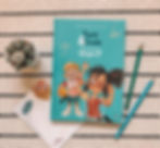
Title: Finni & Fredo - Was kann mein Körper?
Author: Jeanette Bernsau Illustrator: Meike Schneider Publisher: Finni & Fredo Publishing ISBN: 978-3-9821305-0-7
Website: finni-fredo.de
You can also purchase the book via amazon and many book stores in Germany. If you purchase via the amazon link, I will receive a small percentage of the sale.
KEY-FACTS ABOUT THE BOOK
'Finni & Fredo' is a children's book for kids between 5 and 8 years. It's about the human anatomy and internal organs. Finni and Fredo are the main characters and they both start to explore their bodies by questioning how certain things like eating, moving etc. work. This book is simplified, so that kids would understand even the skeleton, but yet accurate!

HOW THINGS STARTED...
By the beginning of 2019 I had quit my job and started to become a full-time freelancer. Illustrating 'Finni & Fredo' was actually my first big project in 2019 after I had done lots of small commissions. I always wanted to illustrate a children's book, since most of my art is kids related anyway, so we signed contracts and started on this book project!

WE STARTED WITH ROUGH SKETCHES
because first we needed to get some ideas what style the characters should be painted in. Jeanette already had some rough ideas in mind and sent me some examples that she liked. From there I did some rough pencil sketches in different styles and she would pick her favourites.
We had to mix and match different characters until we found the final version.
Fredo went through quite a couple of changes as he was suppose to wear a cap in the initial design. We left the cap out in the final design as the tousled hair suited better to his personality. Once we've found the characters, it was time to get some reference sheets done.
I use reference sheets a lot in my process, because it helps me to let my characters stay in character in every pose. When you draw a character so often, you sometimes loose the sense for seeing differences and these reference sheets can help a lot during that process!

Here are some color variations for Fredo. The color palette was found very early in the process and we knew, we liked the colors and wanted them to be like that. It just took a while until we figured out, which clothes had which color and how much red, blue and yellow are in the picture.


Here are some color variations for Finni. We changed her color palette a lot until we were satisfied. The left one is the final design and we went from the far right to the left until we liked it.Both character's color palettes had to work very well together without being identical. So the two on the left were really close, but we went with the left one in the end. It just had a better contrast and worked better with Fredo.


WHICH ILLUSTRATIONS WERE THE HARDEST TO DRAW?
There were quite some tricky ones. The bones for example, had to match these cartoony proportions. It's kind of hard to make the huge hands and feet match regular human proportions. But we managed to get it very accurate without being too complex for children to understand! I really enjoyed working on the muscles! We thought this one would become the hardest illustration, but it turned out to be done quicker than we thought. The hardest illustrations were the nerve tract and blood stream. It took ages to draw all these little blood streams by keeping the main streams super accurate to the human. Same goes for the nerve system.


These two illustrations belong to my favourite non-anatomy paintings. I also like the fact, that Finni is not that stereotype of girl. She's taller and stronger than Fredo. He's a bit more shy and calm and Finni is extroverted in contrast to him. She's also not super girly, which I think is pretty cool!

MAIN ASPECT: SUSTAINABILITY
This is what I love most bout the book. It's produced sustainable. Here are some key-facts about the book:
It's been printed climate neutral.
1 book sold donates 1 Euro to a tree-planting organisation.
Printed on 100% recycling paper
Printed using vegan colors on vegetable oil basis
I actually like the recycling paper so much better than regular paper. It really looks beautiful and works perfect with our color choices!


We put all our heart into this beautiful book! We spent so much more time on everything, like literally 4 times more than we actually planned. But it was sooo worth it!


If you ever get a copy of the book, feel free to tag me on Instagram and let me know how you like it in the comments below!
_________
